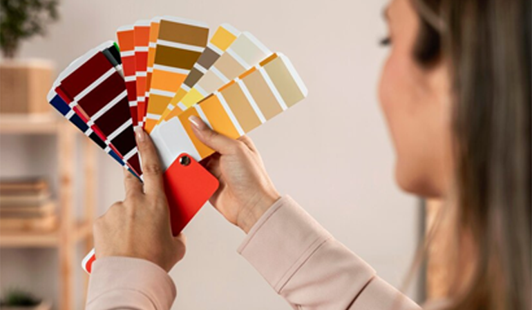
Color is one of the most impactful elements of interior design. It sets the mood, defines the ambiance, and influences how we feel in a space. A well-chosen color palette can transform a room, making it vibrant, cozy, or serene, while poorly selected hues can create discord and discomfort. Color consultation bridges the gap between vision and execution, ensuring every shade, tone, and combination works harmoniously to bring your space to life.
At ELITE CUSTOMS DESIGNED LLC, we specialize in curating bespoke color palettes tailored to your preferences, space requirements, and desired atmosphere. By blending trends with timeless hues, we create harmonious and inspiring environments that reflect your style and personality.
Why Color Matters in Design
Color is more than aesthetics; it affects functionality, perception, and emotion. A strategic approach to color enhances a space’s purpose and resonates with its users.
- Mood Setting: Warm tones like reds and oranges energize, while cool hues like blues and greens soothe. Neutral palettes create balance and versatility.
- Space Perception: Light colors make a room feel more spacious, while dark tones add depth and intimacy.
- Cohesion: A well-coordinated palette ties together furniture, décor, and architectural elements, creating a unified look.
- Functionality: Certain colors are more suited to specific spaces, such as muted tones in bedrooms for relaxation or vibrant shades in playrooms for creativity.
The Science and Art of Color Selection
Our approach to color consultation combines the artistic understanding of color with the science behind how colors interact with light, space, and human psychology.
- Color Theory
We apply principles of color theory to achieve harmony in your space. This includes understanding relationships between:
- Primary, Secondary, and Tertiary Colors The foundational hues and their derivatives.
- Analogous and Complementary Colors: Ensuring colors either flow naturally or create striking contrasts.
- Warm vs. Cool Tones: Balancing emotional impact with practical use.
- Lighting Analysis
Natural and artificial lighting dramatically affects how colors appear. We consider factors like:
- Natural Light Rooms with ample sunlight may enhance lighter shades, while darker rooms may need warm, bright colors to feel inviting.
- Artificial Light: The type of bulbs (LED, incandescent, fluorescent) can alter a color’s temperature and intensity.
- Texture and Finish
A color’s impact isn’t just about hue but also the material and finish. Matte surfaces absorb light, softening the color, while glossy finishes reflect light, intensifying the shade. We consider how colors will interact with textures like wood, stone, or fabric in your space.
The Color Consultation Process
- Initial Assessment
We begin by understanding your vision, preferences, and the purpose of the space. Key questions include:
- What mood or feeling do you want the space to evoke?
- Are there specific colors you love or wish to avoid?
- How will the room be used, and by whom?
- Are there existing elements, such as furniture or flooring, that the color scheme should complement?
- Space Analysis
A thorough evaluation of your space helps us determine practical considerations, such as:
- Room size and layout: Larger spaces may benefit from bold tones, while smaller rooms often suit lighter palettes.
- Lighting conditions: Natural light and artificial sources influence color perception.
- Adjoining rooms: Ensuring a smooth transition between spaces with cohesive palettes.
- Palette Development
Using insights from the assessment, we develop a customized color palette. This includes:
- Base Colors: Neutral tones that anchor the room and provide versatility.
- Accent Colors: Vibrant or contrasting hues that add personality and focus.
- Layered Shades: Variations of the main colors to create depth and dimension.
We present these palettes in the form of digital visualizations, physical swatches, or painted samples, allowing you to see how colors interact in the actual environment.
- Final Selection and Application Guidance
Once the palette is finalized, we provide detailed guidance on how to implement the colors effectively. This includes:
- Suggested finishes (matte, satin, semi-gloss) for walls, ceilings, and trims.
- Recommendations for complementary fabrics, furniture, and décor.
- Tips for balancing colors in specific areas, such as feature walls or focal points.
Tailored Solutions for Different Spaces
- Living Rooms and Common Areas
As the heart of the home, living spaces often require versatile palettes that balance comfort with style.
- Warm Neutrals: Beige, taupe, and soft greys create inviting and timeless backdrops.
- Bold Accents: Jewel tones like emerald or sapphire add drama and sophistication.
- Layering: Combining multiple shades within the same palette adds depth without overwhelming.
- Bedrooms
Bedrooms are personal sanctuaries, best suited to calming and restful tones.
- Cool Tones: Blues, greens, and lavenders promote relaxation.
- Monochromatic Schemes: Variations of a single color, such as soft greys or pastels, create harmony.
- Textures: Introducing textured finishes or wallpapers enhances the serene atmosphere.
- Kitchens and Dining Areas
Kitchens thrive on energy and cleanliness, making vibrant or neutral tones ideal.
- Bright Colors: Sunny yellows, cheerful greens, or crisp whites reflect light and add warmth.
- Contrasts: Dark cabinetry paired with light walls or vice versa creates striking visual interest.
- Accents: Tiles, backsplashes, or feature walls allow pops of color in an otherwise neutral space.
- Workspaces and Offices
- Neutral Bases: Whites, greys, or muted greens create calm and concentration.
- Strategic Accents: Splashes of orange or blue add energy without distraction.
- Custom Themes: Colors tailored to the type of work—creative fields may favor bold hues, while corporate settings suit sophisticated neutrals.
- Outdoor Spaces
- Earthy Tones: Browns, greens, and muted oranges complement nature.
- Bright Pops: Teal, coral, or mustard yellow add vibrancy to patios and decks.
- Weather-Resistant Finishes: Specialized paints and stains ensure lasting beauty.
A productive environment requires a balance of focus and inspiration.
Outdoor areas benefit from palettes that blend with natural surroundings while offering durability.
Incorporating Trends and Timelessness
Our color consultations strike a balance between current trends and timeless appeal.
- Trendy Tones: Incorporating modern colors like Pantone’s Color of the Year or popular shades can add contemporary flair.
- Classic Choices: Timeless palettes, such as monochromatic schemes or nature-inspired tones, ensure your space remains stylish for years.
Sustainability in Color Choices
We prioritize eco-friendly and non-toxic options wherever possible. Low-VOC (Volatile Organic Compound) paints and sustainably sourced pigments provide healthier and more environmentally conscious solutions.
Conclusion: Transforming Spaces with Color Expertise
A thoughtfully curated color palette can elevate any space, transforming it into a harmonious, inspiring, and functional environment. Our color consultation service combines technical expertise with creative vision to guide you in selecting hues that resonate with your personality and meet the demands of your space.
Whether you’re refreshing a single room or embarking on a full-scale renovation, our tailored approach ensures colors that perfectly align with your goals. Let us help you unlock the full potential of your space through the transformative power of color.